Controlling a Google Nest thermostat with Python

Google recently released its Device Access API. This article is a short explanation of how to access and use this API to control a Google Nest thermostat.

We moved to a new house a few months ago and the previous owners left their thermostat behind. This thermostat turned out to be a brand new Nest smart thermostat. Of course, I wanted to connect this smart device to my home automation. But unfortunately, after some searching, I found out that most connections were deprecated after Google acquired Nest a couple of years ago, along with the API access for consumers. The only option was to sign up for a waitlist.

But to my surprise, I got an email from Google a couple of weeks ago! The Device Access Console is now available to individual consumers as well as commercial partners. I wanted to find out if I could control my Google Nest thermostat so I wrote some Python code for this.

E-mail from Google
E-mail from Google

Get started with Google documentation

Google has written some quite elaborate documentation about all the steps needed to access the API. The purpose of this article is not to rewrite their help articles. These articles will get you started:

And you’ll also need these links:

How much does it cost?

Before creating your first project, you must pay a one-time, non-refundable fee (US$5) per account. There can also be cost involved by using Google Cloud services, but I have been polling my thermostat every 5 minutes for a couple of weeks now without cost.

Gather all requirements

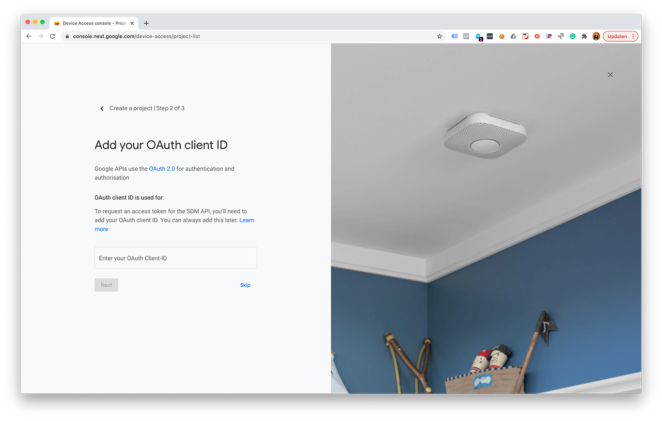
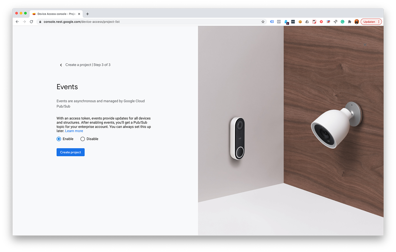
It’s tempting to begin creating a Device Access project right away (I did so too), but I found out that it is probably easier to get all the necessary prerequisites first. Before you can start coding you should follow these steps:

  1. Create a Google Cloud Console project at console.cloud.google.com
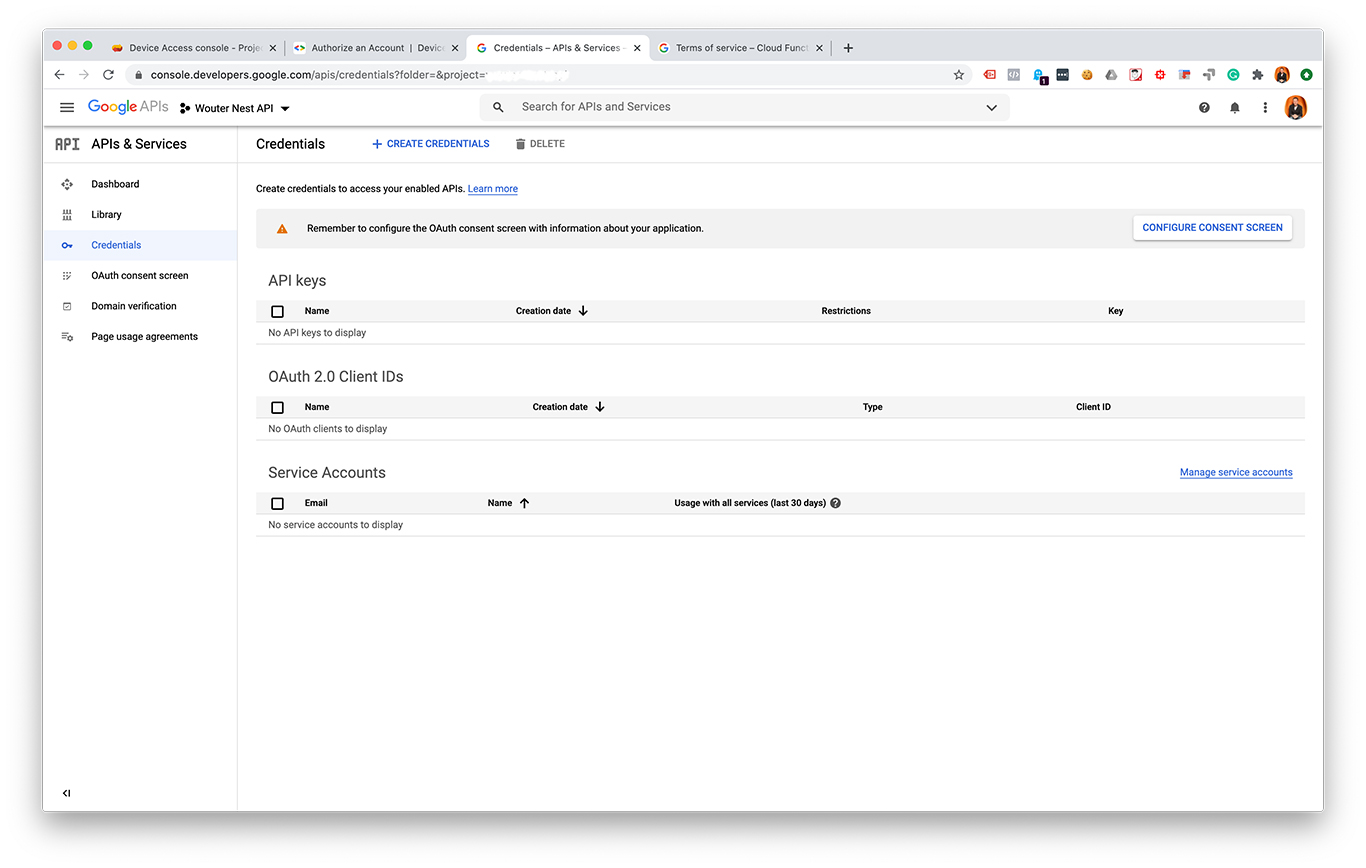
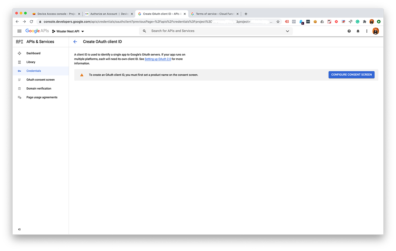
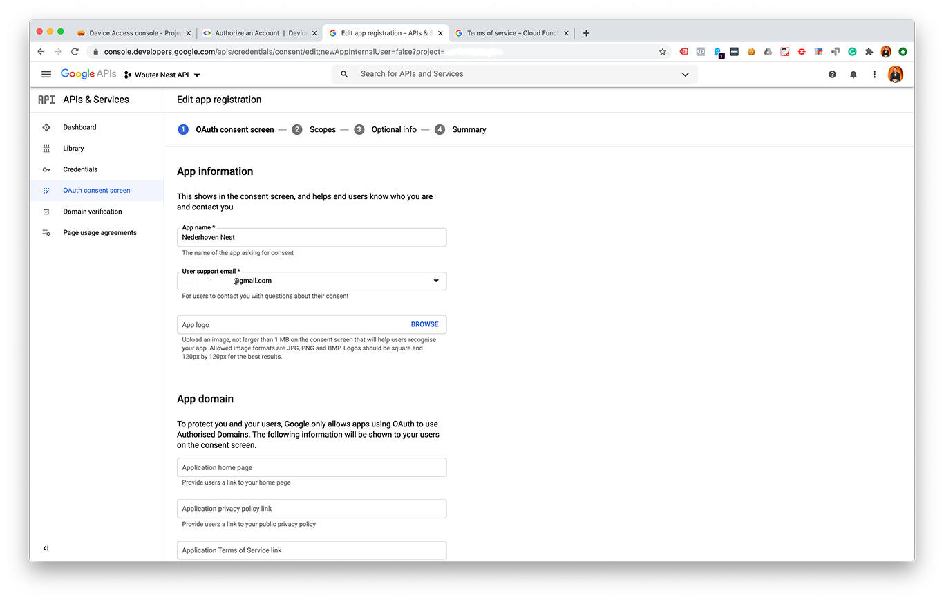
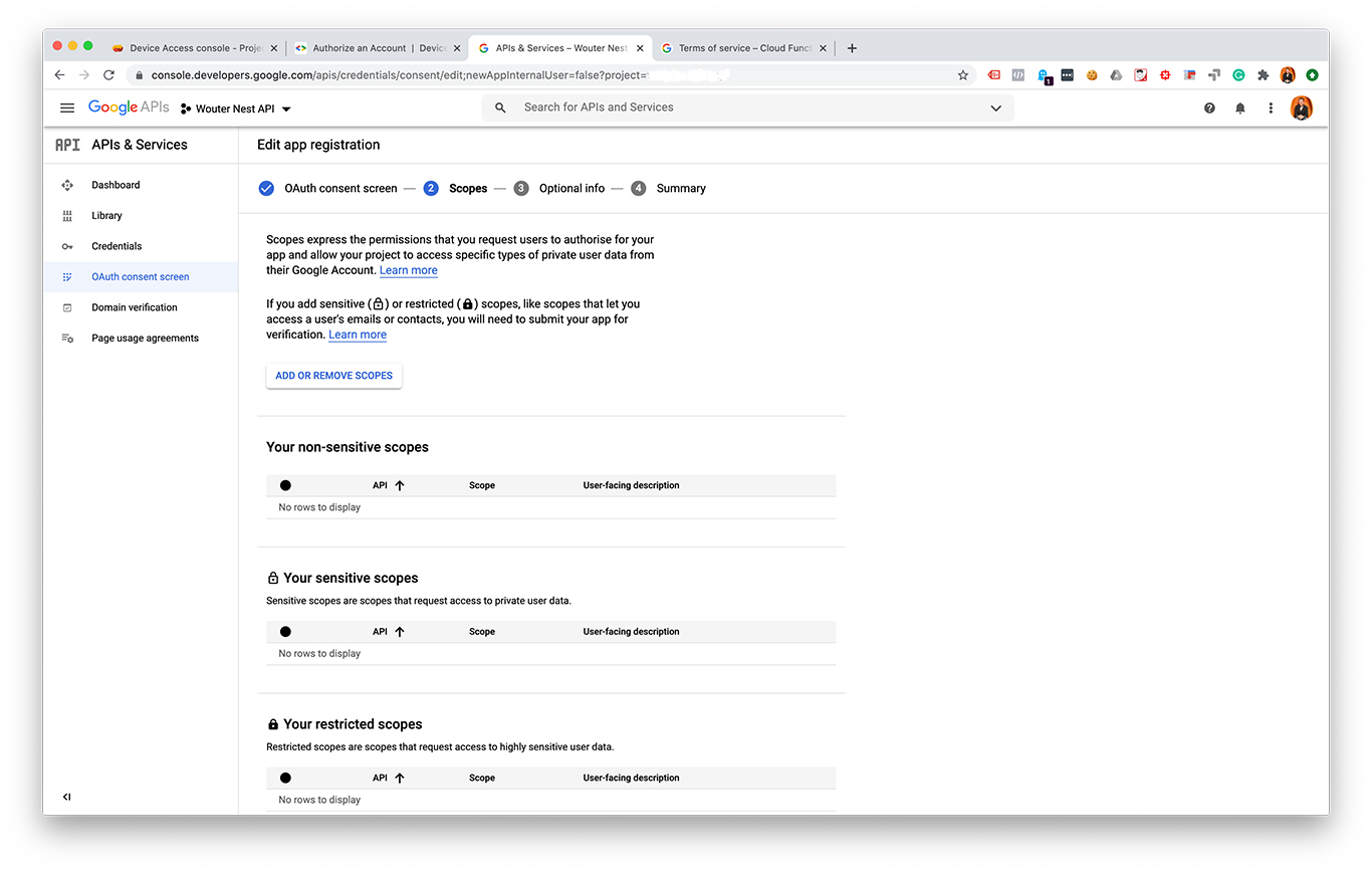
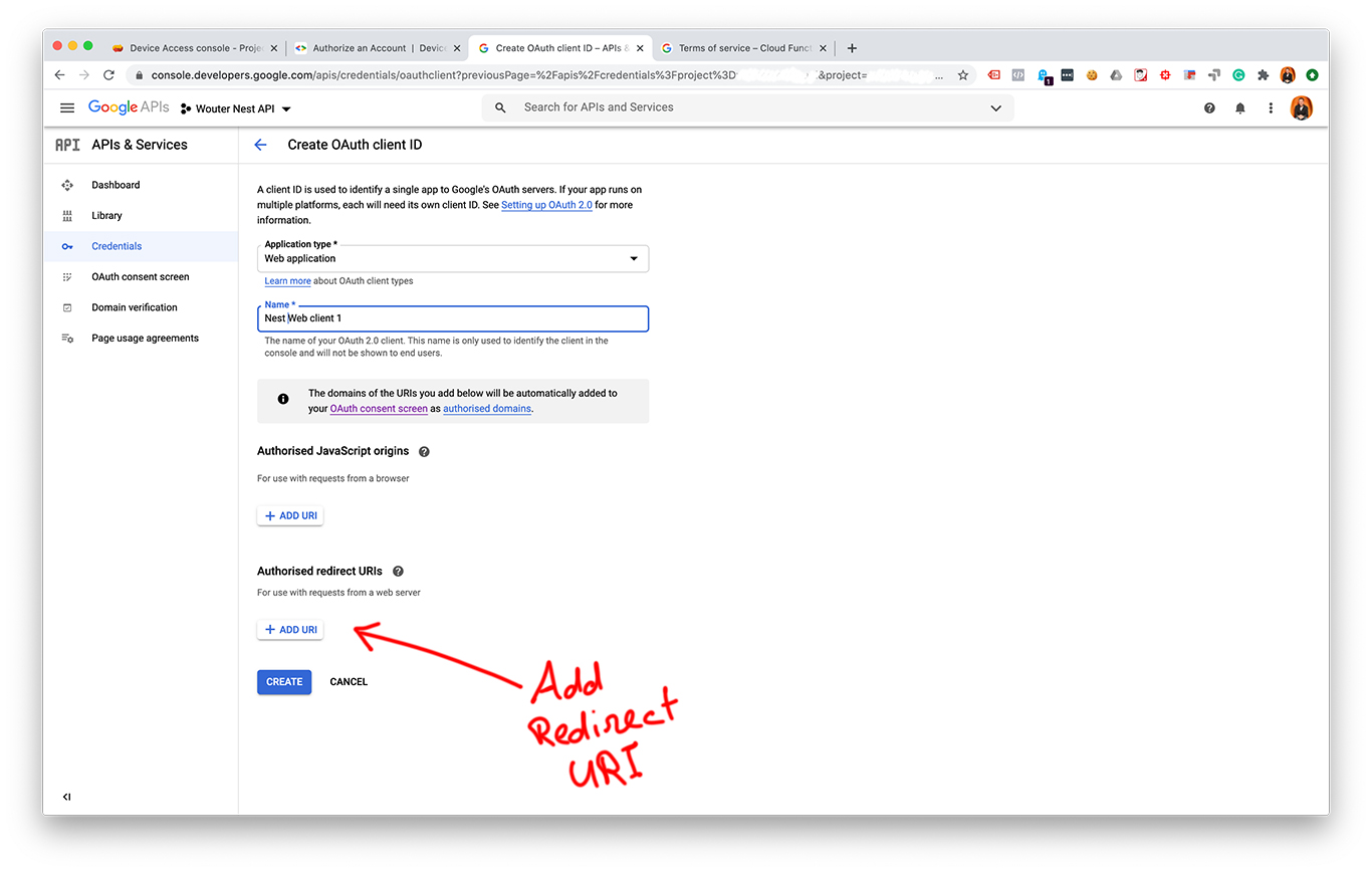
    1. Create Cloud Console oAuth 2.0 credentials
    2. Set a redirect URI
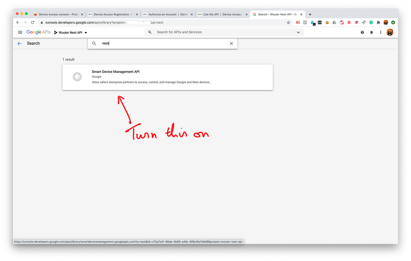
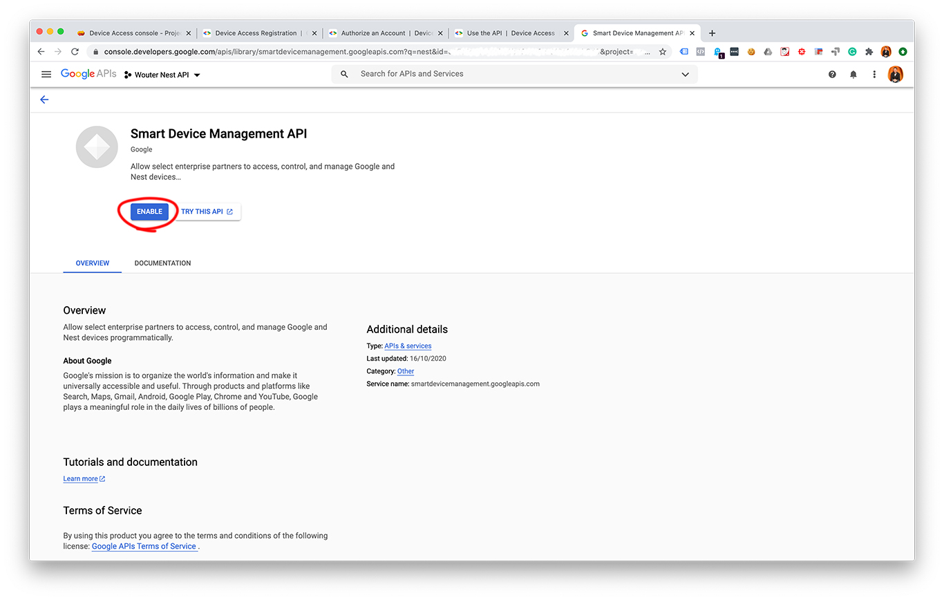
    3. Turn on the Smart Device Access API
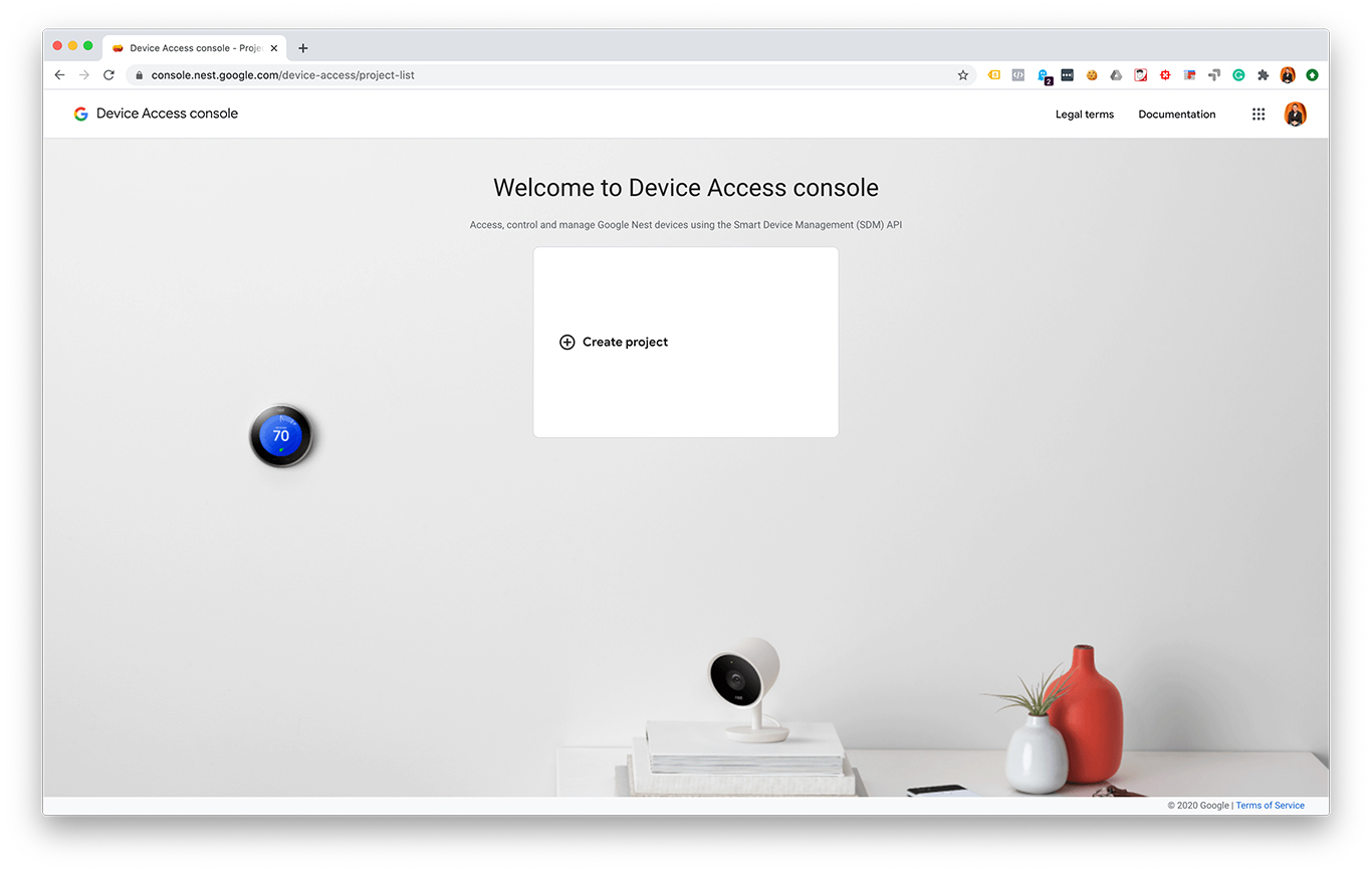
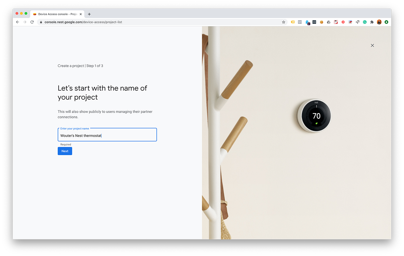
  2. Create a Device Access project at console.nest.google.com

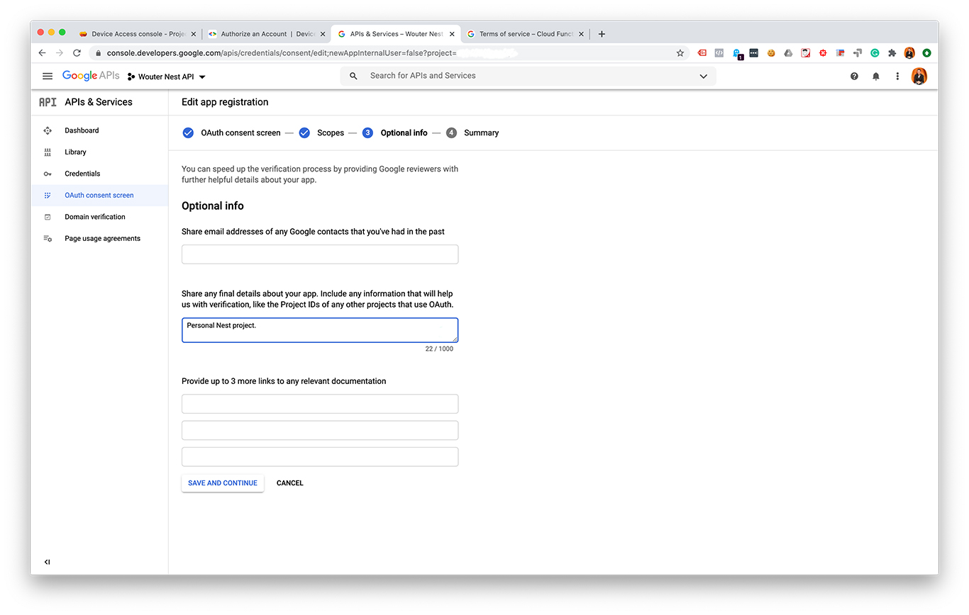
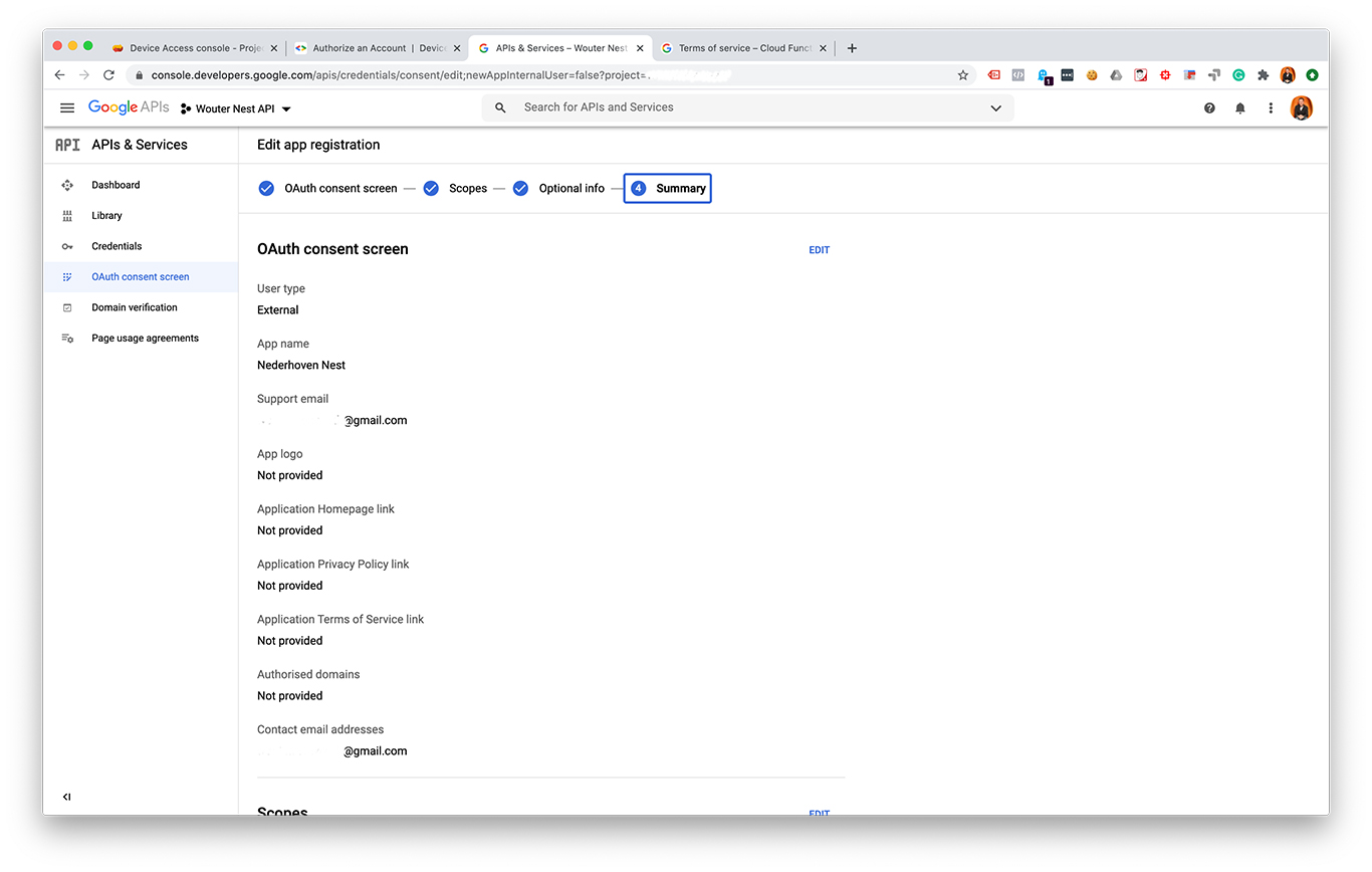
I made some screenshots from each step:

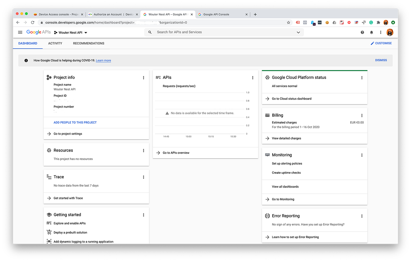
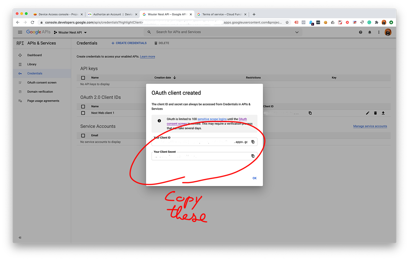
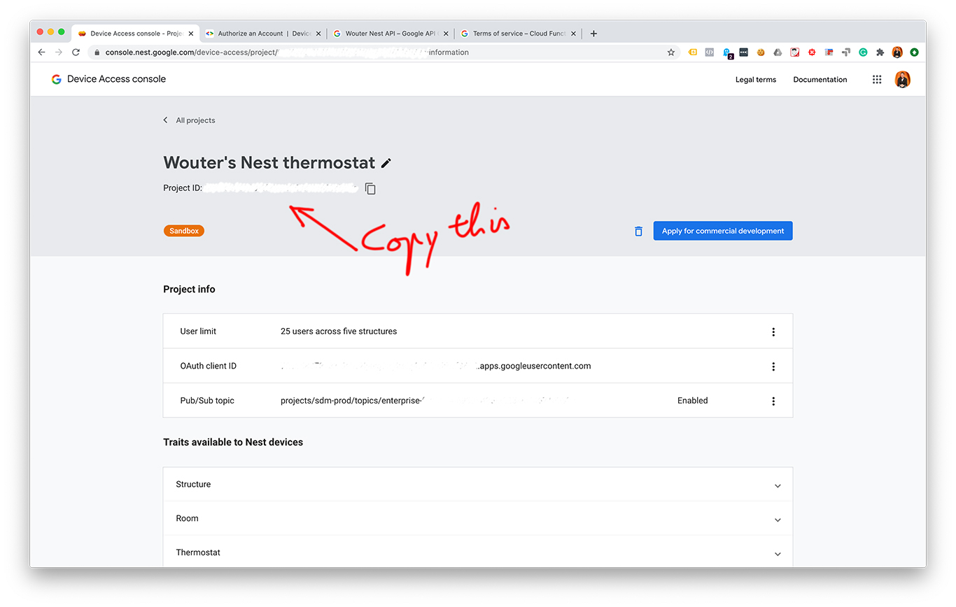
After creating an OAuth 2.0 client ID and a Device Access project you should have these values:

  • A project ID. You can find this in your Device Access console.
  • A client ID. You can find this with your OAuth credentials.
  • A client secret. You can find this with your OAuth credentials.
  • A redirect URI. This URI can be almost any URL you want, as long as this URL matches a URI that is entered as an authorized redirect URI in your Cloud Console project. 

Some example API calls with Python

Now we can start making API calls! Below is a Jupyter Notebook that walks through all the steps to control a Nest thermostat.

You can also make a copy of the Google Colab notebook I made.

Open In Colab

Example for making Nest API calls

Please start by making a copy of this notebook.

Enter your credentials

Enter your credentials and run the cell to generate a login URL. Click the URL and log in to your Google account.

In [ ]:
project_id = 'your-project-id'
client_id = 'your-client-id.apps.googleusercontent.com'
client_secret = 'your-client-secret'
redirect_uri = 'https://www.google.com'

url = 'https://nestservices.google.com/partnerconnections/'+project_id+'/auth?redirect_uri='+redirect_uri+'&access_type=offline&prompt=consent&client_id='+client_id+'&response_type=code&scope=https://www.googleapis.com/auth/sdm.service'
print("Go to this URL to log in:")
print(url)

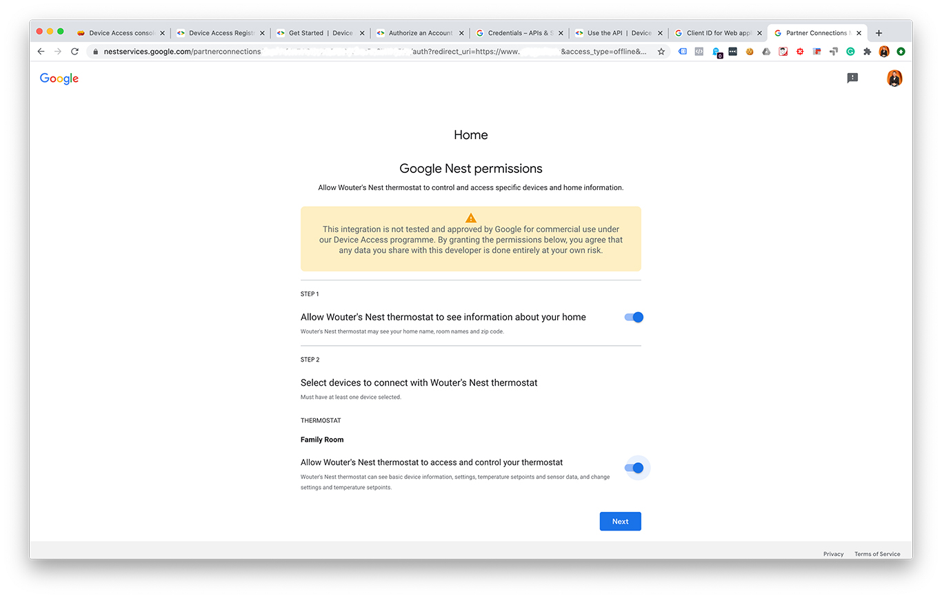
After logging in you are sent to URL you specified as redirect_url. Google added a query to end that looks like this: ?code=.....&scope=... Copy the part between code= and &scope= and add it below:

In [ ]:
code = '4/add-your-code-here'

Get tokens

Now we can use this code to retrieve an access token and a refresh token:

In [ ]:
# Get tokens

import requests

params = (
    ('client_id', client_id),
    ('client_secret', client_secret),
    ('code', code),
    ('grant_type', 'authorization_code'),
    ('redirect_uri', redirect_uri),
)

response = requests.post('https://www.googleapis.com/oauth2/v4/token', params=params)

response_json = response.json()
access_token = response_json['token_type'] + ' ' + str(response_json['access_token'])
print('Access token: ' + access_token)
refresh_token = response_json['refresh_token']
print('Refresh token: ' + refresh_token)

Refresh access token

The access token is only valid for 60 minutes. You can use the refresh token to renew it.

In [ ]:
# Refresh token

params = (
    ('client_id', client_id),
    ('client_secret', client_secret),
    ('refresh_token', refresh_token),
    ('grant_type', 'refresh_token'),
)

response = requests.post('https://www.googleapis.com/oauth2/v4/token', params=params)

response_json = response.json()
access_token = response_json['token_type'] + ' ' + response_json['access_token']
print('Access token: ' + access_token)

Get structures and devices

Now lets get some information about what devices we have access to and where these are "located". Devices are part of a structure (such as your home). We can get information about the structures we have access to:

In [ ]:
# Get structures

url_structures = 'https://smartdevicemanagement.googleapis.com/v1/enterprises/' + project_id + '/structures'

headers = {
    'Content-Type': 'application/json',
    'Authorization': access_token,
}

response = requests.get(url_structures, headers=headers)

print(response.json())

But we can also directly retrieve the devices we have access to:

In [ ]:
# Get devices

url_get_devices = 'https://smartdevicemanagement.googleapis.com/v1/enterprises/' + project_id + '/devices'

headers = {
    'Content-Type': 'application/json',
    'Authorization': access_token,
}

response = requests.get(url_get_devices, headers=headers)

print(response.json())

response_json = response.json()
device_0_name = response_json['devices'][0]['name']
print(device_0_name)

Get device stats

For this example I simply took the first item of the array of devices. I assume most people probably have one Nest thermostat anyway.

The name of a device can be used to retrieve data from this device and to send commands to it. Lets get soms stats first:

In [ ]:
# Get device stats

url_get_device = 'https://smartdevicemanagement.googleapis.com/v1/' + device_0_name

headers = {
    'Content-Type': 'application/json',
    'Authorization': access_token,
}

response = requests.get(url_get_device, headers=headers)

response_json = response.json()
humidity = response_json['traits']['sdm.devices.traits.Humidity']['ambientHumidityPercent']
print('Humidity:', humidity)
temperature = response_json['traits']['sdm.devices.traits.Temperature']['ambientTemperatureCelsius']
print('Temperature:', temperature)

Set thermostat to HEAT

And last but not least, lets send some commands to our thermostat. The cell below contains the code to set the mode to "HEAT":

In [ ]:
# Set mode to "HEAT"

url_set_mode = 'https://smartdevicemanagement.googleapis.com/v1/' + device_0_name + ':executeCommand'

headers = {
    'Content-Type': 'application/json',
    'Authorization': access_token,
}

data = '{ "command" : "sdm.devices.commands.ThermostatMode.SetMode", "params" : { "mode" : "HEAT" } }'

response = requests.post(url_set_mode, headers=headers, data=data)

print(response.json())

Set a new temperature

And finally we can set a temperature by executing this command:

In [ ]:
set_temp_to = 21.0
In [ ]:
# Set temperature to set_temp_to degrees

url_set_mode = 'https://smartdevicemanagement.googleapis.com/v1/' + device_0_name + ':executeCommand'

headers = {
    'Content-Type': 'application/json',
    'Authorization': access_token,
}

data = '{"command" : "sdm.devices.commands.ThermostatTemperatureSetpoint.SetHeat", "params" : {"heatCelsius" : ' + str(set_temp_to) + '} }'

response = requests.post(url_set_mode, headers=headers, data=data)

print(response.json())

How to find the fastest section within a GPX file with Python & Jupyter Notebooks

One of the fun things when you like both data and running is that you can collect loads of data by running with a GPS tracker or a mobile phone. With apps such as Strava, Runkeeper or Endomondo you get all kinds of statistics about your workouts. I’ve been using Endomondo for several years now and when I found this really interesting article by Steven van Dorpe about how to analyze GPS data with Python I wanted to try doing some analysis for myself.

Specifically, in this blog we’ll go through the steps to find the best or fastest section within a workout. For example, if I ran 12 kilometers, started slow and finished fast, what was the time for the fastest 10 kilometers during that entire workout? And what was my fastest 10 kilometer this year for example? Let’s find out!

There is this specific chart from Endomondo that I like a lot: my personal best for a specific distance over time. The interesting thing about this graph is that it shows my personal best for a specific distance from within a longer workout.

Endomondo graph for my personal best for 5K over time.

Unfortunately this graph has some limitations, especially when you’re not a premium (paying) user of Endomondo. The free version only shows personal bests for 5 kilometers or 3 miles. PB’s for other distances are only available for premium users. (I leave it up to you to decide if you find it ethical to replicate some functionality from the premium features.) 😉 And interesting stats such as my PB’s for specific combinations are not available at all, such as my fastest 5K from workouts over 10K over the past 12 months. (Sidenote: I’ve been a paying user for quite some time in the past and I also bought the app for a fixed price many years ago.)

Parsing and preparing the data

Anyway, lets see if we can build on Steven’s instructions to find the fastest 5K, 10K, and so on within a workout. Endomondo and most other running apps let you download your workouts as GPX files. These files contain the data about your GPS location, altitude and time. I use Python and Jupyterlabs Notebooks (which is included with Anaconda) for parsing and analysing these files.

Let’s get coding! The first step is to include some packages:

Then declare some variables and parse the GPX file:

In Steven van Dorpe’s article, all data is added by using data = gpx.tracks[0].segments[0].points but I found that some GPX files contain multiple segments with relevant data, some don’t, some contain multiple segments where the last segment should be omitted, and so on. You should really inspect your data to see what data you need. For recent Endomondo GPX files I found that if the file contains multiple segments, I should import all segments except the last segment, unless the file contains only one segment, because then we need all segments.

For this blog let’s assume you can include all segments. Oh, and let’s also apply some sorting and filling to clean any problems in the data:

So far we’ve been following the instructions from the article by Steven, but from here we’ll be doing some things different. Instead of looping over data to calculate distances I decided to stick with Pandas and use vectorization to try to speed things up. At this point we’re working on a single GPX file, but eventually we may want to loop over a folder with multiple GPX files (270 in my case) and speed suddenly becomes important (as we’ll see later). Using vectorization and the apply() method to calculate distances involved adding some extra columns to the DataFrame with values that are “shifted one row backwards”:

Some GPX files gave me a hard time about timezones. These lines fixed this:

And then the actual calculations for distances and time differences with Pandas apply(). The math behind this is all explained thoroughly in the article by Steven van Dorpe I mentioned earlier. If you’re at this point in this blog and you still haven’t read his article, I can definitely recommend you do this first and then continue with the code below:

Then as a final substep before the actual search for the fastest sections I create a new DataFrame that only contains the columns needed for further calculations to speed things up a little bit more. Here I also add two columns for cumulative sums for these columns.

Finding the actual fastest section

Remember that at the beginning of this blog we created a list with sections? Now it’s time to loop over this list and find the fastest kilometer, fastest 5 kilometer, fastest 5 miles, and so on.

If the current section is longer than the total distance of the entire workout there is no need to do any further analysis and we can skip ahead to the next iteration.

To find the fastest section within the entire workout we must loop over the DataFrame.* For every row we locate the first row further ahead where the cumulative sum of the total distance minus the cumulative distance at this row is greater or equal to the section.

*) I know that looping over a DataFrame is not the best solution in terms of speed. However, I have not found a way to get the same results without this loop. Did you find a faster way to do this? Let me know! 🙂

That’s a lot to take in… 😉 So let me give you an example. Lets say we want to find the fastest 50 meters from the virtual workout below:

TimeDistance
0 seconds0 meters
10 seconds10 meters
20 seconds25 meters
30 seconds35 meters
40 seconds45 meters
50 seconds55 meters
60 seconds60 meters
70 seconds70 meters
80 seconds85 meters
90 seconds90 meters
  • At 0 seconds and 0 meters we find the first row that is 50 meters or more ahead, which is the row at 50 seconds and 55 meters. The speed over this section was (55 meter / 50 seconds) = 1.1 meter per second.
  • Then we start at the second row with 10 seconds and 10 meters and find the first row that is 50 meters or more ahead, which is the row at 60 seconds and 60 meters. The speed over this section was ((60 meter – 10 meter) / (60 seconds – 10 seconds)) = 1.0 meter per second.
  • Then we start at the third row with 20 seconds and 25 meters and find the first row that is 50 meters or more ahead, which is the row at 80 seconds and 85 meters. The speed over this section was ((80 meters – 25 meters) / (80 seconds – 20 seconds)) = 0.92 meters per second.
  • … and so on…

The first iteration with 1.1 meter per second is the fastest section, because it traveled the section of 50 meter with the highest average speed.

This is what this looks like in code:

The result in df_final looks something like this:

The output of df_final
The best sections according to Endomondo
SectionCalculations based on timeEndomondo
1 km283 seconds = 4:434:42
1 mi468 seconds = 7:487:47
3 km887 seconds = 14:4714:45
5 km1485 seconds = 24:4524:43
10 km3031 seconds = 50:3150:31

As you can see, our calculations are pretty close, but not exactly the same. When you study the screenshot of the DataFrame more closely, the distance of each section is also just a little bit more than the actual section. So for the time it took to travel 3 km, I actually travelled 3.005 km. This would explain why we got one or two seconds more for each section. Let’s see if the results are better when we account for this by using the average speed over the fastest section for our calculations:

SectionCalculations based on minutes per kilometerEndomondo
1 km4.699604 * 1 = 4:424:42
1 mi4.839385 * 1.60934 = 7:477:47
3 km4.918145 * 3 = 14:4514:45
5 km4.944354 * 5 = 24:4324:43
10 km5.051423 * 10 = 50:3150:31

Now my calculations exactly match the results from Endomondo! Nice!

Working with multiple GPX files

So far we’ve used only a single GPX file, but for statistics like the fastest 10K over the past 12 months we need to import all workouts during that timeframe. For my personal project I wanted to include all my workouts. So that’s what I did!

The following code is a combination of all the code snippets above, but it also collects all GPX files included in a subfolder /tracks/ and loops over all of them. This might take a while to run though, so make sure not to include too many files.

Final result

With the output data in df_final we can continue to make plots, extract data and so on. With just a few more lines of code I can for example find out how far I’ve ran on my current shoes so far (709 km), make scatter plots of distance and date (apparently I had a habit of stopping at exactly 10 kilometers in 2016) or make my own version of the Endomondo graph at the top of this blog (it’s not as fancy yet, but close).

All my workouts displayed as a scatter plot
Best 10 km’s per month

So this is it! We’ve looped over a DataFrame to find the fastest sections from a list of GPX files. Perhaps I’ll build on this script to build a nice dashboard for my running activities, but that’s something for later.

Some final thoughts

Probably my biggest “concern” with this entire endeavour is the contents of the GPX files compared to the Endomondo app and interface. As it turns out, the total distance of the workouts from the GPX files is just slightly lower compared to what Endomondo reports. And I know this discrepancy is not caused by my calculations, because I found out that if I would upload a GPX file back to Endomondo it would also have a lower total distance!

An example workout sums up to a maximum total distance of 13303 meters or 13.30 kilometers in my calculations. According to the Endomondo interface, this workout should actually be 13.32 kilometers. However, when I upload this GPX file back to Endomondo it would only be 13.29 kilometers. Weird…

Endomondo reports 13.32 km
Uploading the same workout would report 13.28 km

Also, I learned a lot about the importance of speed with this project. The original instructions by Steven van Dorpe were too slow for my use case (but very educational nonetheless). But even with all the vectorization and apply() methods that I could get to work in this project it will still take minutes or more to loop over multiple GPX files. So keep this in mind if you’re trying to build on my examples. 🙂

View your Google Ads creatives as a Google Optimize website experiment

The idea

Doing A/B experiments with text ads and other creatives in Google Ads is getting less important with the introduction of Responsive Search Ads. But that doesn’t mean that it’s gone completely. It’s still relevant to optimise text ads based on data, just as we should never stop optimising our websites. At Adwise, we usually do this with a Google Ads script that is an improved version of the A/B testing script by Russ Savage from Freeadwordsscripts.com or by simply calculating for a statistical significant difference manually. This works, but I feel it lacks a graphical component to clarify the outcome.

The Google Optimize interface on the other hand contains a beautiful graph to visualise the results of an experiment.

The Google Optimize interface, image by Google.

The graph shows the cumulative conversion rate of a variant together with a confidence interval over time. It provides a clear overview of the experiment and makes it easy to compare and interpret the statistical differences between each variant.

Wouldn’t this graph be perfect for other tests and experiments as well? What about using this graph to compare the results of different Google Ads text ads? I think it’s worth trying out, so I created a little “proof of concept” that looks like the image below. It’s also interactive! Try for yourself here!

An example graph made with Bokeh in Google Colab

I created this graph using Bokeh. I found a Bokeh example that provided a good starting point for building my own graph in a (Jupyter) Notebook. I also opted to use Google Colaboratory, because I could create my notebook online and have easy access to Google Drive. This is convenient, because this would open the possibility to use Google Sheets with the Google Analytics plugin to retrieve data about Google Ads text ads. If you’ve lost me here, I understand! I’ll go over the steps one by one below. The important thing to note here is that I use only freely available tools so you can recreate (and probably improve) my idea.

The math

Statistics was not my favourite subject in high school, but I ended up in an analytical job anyway. 😉 If I’m not mistaken, we should calculate a binomial confidence interval. A user can either click or not click. Or a user can either convert or not convert. So there are always two possible outcomes, which brings us to a binomial distribution.

Build your own version of this graph

Step 1: Copy the example spreadsheet

Make a copy of this spreadsheet:
https://docs.google.com/spreadsheets/d/1ZYHolhOfdcCzbhNLCAZfrJ1HPA2fbYu2StDDCOEGCt8/edit?usp=sharing
The copy should also include the Google Analytics plugin, which you can use to retrieve data about your Google Ads text ads from your Google Analytics account. You should change the value in cell B3 to your own Analytics profile ID and change the filter in cell B9 on the sheet named ‘Report Configuration’ to the name of an ad group in your Google Ads account. You can also make other changes if needed. Then run the report to refresh the data. If you’re not familiar using the Analytics plugin, you can read about it at the Google Developers website.

Step 2: Copy the Colab notebook

Then make copy of this Google Colaboratory notebook:
https://colab.research.google.com/drive/1N4aXN8hmWjU6YY7ycasizHlWiwxqgVAP
After making a copy check if the first cell contains the name of the spreasheet you created in step 1 and edit if necessary. Then you can run all the cells. At cell 3 you’ll be presented with a URL to authenticate and connect Google Drive. Click the URL and follow the steps. You’ll receive a code that you can paste in the new field that appeared in your notebook.

Step 3: check out your awesome graph.

If everything worked the way it should, you should see an interactive graph at the bottom of the notebook that looks similar to the graph in the screenshot above. There are probably easier ways to get the same kind of graph, but I chose to use free tools that require some extra steps. It’s not perfect, but I guess it’s a MVP that can be improved upon. 🙂

Anyway, I’m eager to hear what you think about using this type of graph to analyse the results of Google Ads text ads!