
The idea
Doing A/B experiments with text ads and other creatives in Google Ads is getting less important with the introduction of Responsive Search Ads. But that doesn’t mean that it’s gone completely. It’s still relevant to optimise text ads based on data, just as we should never stop optimising our websites. At Adwise, we usually do this with a Google Ads script that is an improved version of the A/B testing script by Russ Savage from Freeadwordsscripts.com or by simply calculating for a statistical significant difference manually. This works, but I feel it lacks a graphical component to clarify the outcome.
The Google Optimize interface on the other hand contains a beautiful graph to visualise the results of an experiment.
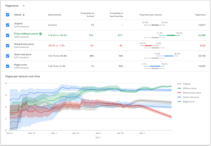
The graph shows the cumulative conversion rate of a variant together with a confidence interval over time. It provides a clear overview of the experiment and makes it easy to compare and interpret the statistical differences between each variant.
Wouldn’t this graph be perfect for other tests and experiments as well? What about using this graph to compare the results of different Google Ads text ads? I think it’s worth trying out, so I created a little “proof of concept” that looks like the image below. It’s also interactive! Try for yourself here!

I created this graph using Bokeh. I found a Bokeh example that provided a good starting point for building my own graph in a (Jupyter) Notebook. I also opted to use Google Colaboratory, because I could create my notebook online and have easy access to Google Drive. This is convenient, because this would open the possibility to use Google Sheets with the Google Analytics plugin to retrieve data about Google Ads text ads. If you’ve lost me here, I understand! I’ll go over the steps one by one below. The important thing to note here is that I use only freely available tools so you can recreate (and probably improve) my idea.
The math
Statistics was not my favourite subject in high school, but I ended up in an analytical job anyway. 😉 If I’m not mistaken, we should calculate a binomial confidence interval. A user can either click or not click. Or a user can either convert or not convert. So there are always two possible outcomes, which brings us to a binomial distribution.
Build your own version of this graph
Step 1: Copy the example spreadsheet
Make a copy of this spreadsheet:
https://docs.google.com/spreadsheets/d/1ZYHolhOfdcCzbhNLCAZfrJ1HPA2fbYu2StDDCOEGCt8/edit?usp=sharing
The copy should also include the Google Analytics plugin, which you can use to retrieve data about your Google Ads text ads from your Google Analytics account. You should change the value in cell B3 to your own Analytics profile ID and change the filter in cell B9 on the sheet named ‘Report Configuration’ to the name of an ad group in your Google Ads account. You can also make other changes if needed. Then run the report to refresh the data. If you’re not familiar using the Analytics plugin, you can read about it at the Google Developers website.
Step 2: Copy the Colab notebook
Then make copy of this Google Colaboratory notebook:
https://colab.research.google.com/drive/1N4aXN8hmWjU6YY7ycasizHlWiwxqgVAP
After making a copy check if the first cell contains the name of the spreasheet you created in step 1 and edit if necessary. Then you can run all the cells. At cell 3 you’ll be presented with a URL to authenticate and connect Google Drive. Click the URL and follow the steps. You’ll receive a code that you can paste in the new field that appeared in your notebook.
Step 3: check out your awesome graph.
If everything worked the way it should, you should see an interactive graph at the bottom of the notebook that looks similar to the graph in the screenshot above. There are probably easier ways to get the same kind of graph, but I chose to use free tools that require some extra steps. It’s not perfect, but I guess it’s a MVP that can be improved upon. 🙂
Anyway, I’m eager to hear what you think about using this type of graph to analyse the results of Google Ads text ads!